 Deck of 1000 Spreads by Tierney Sadler (Llewellyn 2013)
I first read about this spreadcrafting tool months ago at AT, and thought the idea imminently practical. It's such a simple and obvious idea, it's surprising no one's taken the initiative to produce and publish something like this already. Well done to Tierney for doing it! The concept behind this set is simplicity itself: a set of oversized cards which serve as markers for a tarot spread. They underlie the cards in a spread, showing the name of each card position. Why would anyone need such a thing? Several reasons: 1) it saves the hassle of drawing out an original spread on a bit of paper and then having to refer to it repeatedly during the reading to remind yourself what the cards stand for, 2) it saves the embarrassment of forgetting a card position during a live reading (which does happen, particularly if you're doing many readings back to back and each person gets a different spread--trust me, you never want to be saying, 'Oh, did we say this card was Finances or Relationships?' The looks you get, oh dear!), 3) it saves you having to tell the querent over and over what the card stands for (if you do that sort of thing). And 4) if you're learning a new spread you've found elsewhere, it saves you having to refer to the screen, book or your notes repeatedly as you try it out. It's just a handy dandy little idea.
What's Included
The set consists of the usual flimsy Llewellyn box. Inside is a white cardboard insert which fits the interior of the box snugly (an innovation for Llewellyn!) and is meant to hold the cards. Unfortunately, although the insert fits the outer box, the cards do not fit the insert, so they do slide around in there. I don't know why Llewellyn can't get this right. The companion book fits snugly over the insert, so at least the cards will stay in the insert when the whole contraption is shut. I don't intend to keep my cards in this box anyway, so it's not that big a deal.
The deck has 65 cards. Six of them are blank, then there is a Significator card (I never use those) and one is labelled 'Card of the Day' which I don't find particularly useful as I don't need a marker to remind me a single card draw is the card of the day, and wouldn't use it as a position in a larger spread. The remainder of the cards are colour-coded. More on the system later.
The companion book is a soft cover 137-page book detailing how to use the system. It has the usual glued binding, and because it is not stitched, it will not be particularly easy to train it to lie flat, which is a shame. Hands free would be quite useful for this set.
The Cards
The cards are of a supple thickness with a very light lamination, measuring 7 x 15 cm (3 x 6 in). This makes them too long to riffle shuffle, for me at least. However, I don't think you'd be shuffling them much, anyway.
One of the things that held me back from ordering the set this long is that I find the look of the cards uninspired. Each card is coloured, with the name of the spread position in white capital letters at the top, a few words about the position in the middle, and the type of card at the bottom. Between each bit of information there are some scrolly embellishments. It looks like it took about five minutes to design. I really don't know what I would rather have seen, but the cards are quite bland and it did put me off. The concept of the set is too good to pass up, though, so I bought it. If a more stylish-looking one comes out in future, I'll no doubt buy it, too!
The cards are divided into five subsets, colour-coded. I don't think I'll be giving away any secure information to tell you that they are:
Green topic cards - the subject of the reading (Finances, Romance, etc)
Blue influence cards - what is having an impact on the subject of the reading (Unconscious Desires, Attitudes, etc)
Orange people cards - people who have an impact on the subject of the reading (Co-Workers, Family, etc)
Purple timing cards - how the past, present and future impact the subject of the reading
Red outcome cards - how it all turns out, lessons to be learned, etc
These are the basic elements of nearly all tarot spreads. Tierney, the deck creator, researched many spreads and used her own experience as a tarot reader to create these cards for the most common spread positions in each category, so you can select from these to lay out any spread. The blank cards can be used if you can't find the exact right card you're looking for (she suggests putting a little sticky note on the card). The colour-coding seems important according to the book, but I don't really see why it's needed other than to keep all the like cards with like, which one could do easily enough by reading the word at the bottom of the card, and I myself would prefer if they were all the same colour, for reasons you will see below.
The Book
The book, as you would expect, explains the concept behind tarot spreads, and then goes into the various ways you can use Deck of 1000 Spreads in your tarot practice. It is divided in three sections: Basics, Spreadcrafting, and Sample Spreads. The book is handy for those new to tarot or tarot spreads, and also is a way into creating original spreads for those who always use spreads written by others. For example, Tierney shows how to take the classic Celtic Cross spread and 'retool' it (by changing a few of the positions) and 'revision' it (by keeping the structure of the layout but changing every position's meaning).
I'm aware that many readers are offering Tierney their creative ideas for using the cards. It might be nice if, when/if she creates a top-up set to add to this one, she did a second companion book offering many of these new innovations spreadcrafters have already developed. (Hint!)
One interesting use is to 'divine a spread', where you shuffle and draw card positions for a reading. It's sort of like asking, 'What do I need to ask about this topic?' I haven't tried that yet but it seems like a fun idea. I'll post the results when I finally get around to trying it.
A Personal Sample
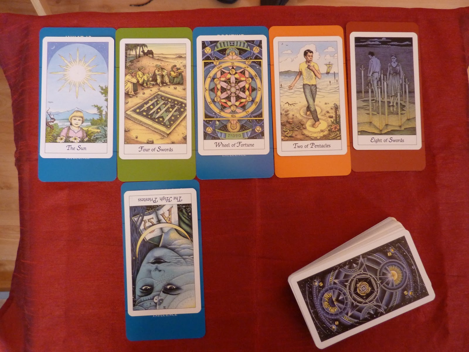
I've been fiddling around with this set for a few days now and thought I'd give it a whirl, so I decided to do a little reading on Finances. I selected the Finances marker and set it on the table. I thought I'd put down 'What is Hidden' to find out if there's anything I don't know that I ought to know. I put it to the left of Finances. I laid Positive Influences to the right. Then underneath Finances, I put 'Unconscious Desires' to see what might be lurking there. I added 'Partner' to the mix to see how the hubster fits in, and then Outcome at the end:
 |
| Deck of 1000 Spreads, Llewellyn 2013 |
I decided to lay the cards out in this order 1) Finances, 2) Positive Influences, 3)What is Hidden, 4) Unconcious Desires, 5) Partner, 6) Outcome.
 |
| Deck of 1000 Spreads with Cosmic Tarot |
1) Selecting card positions with aid of the Deck of 1000 Spreads set encourages me to throw in more card positions than I normally would. This is not necessarily a good thing to me. It's like how you take more M & Ms from a big bowl of them than you would from a small pack. You just do it because they're there, not because you need that many. Rather than looking through the deck selecting card positions that sound good, I believe it would be best to decide what card positions you want, and then find those in the pack. It's a subtle difference, but gives you more control over making the spread you actually want rather than having a sprawling layout based on things that you threw in because they sounded good when you saw them.
2) I am highly verbal and the giant white lettering at the top distracts me greatly from the tarot cards themselves. The card position becomes more important than the card. I decided to solve that by sliding the tarot card up to cover the heading, and if I need the label as a memory aid (the entire purpose of the set after all, at least as I see it), then I can always slide it down for a quick peek:
 |
| Deck of 1000 Spreads, headings obscured by Cosmic Tarot! |
Personally, I don't see the point of the colour-coding, and would prefer it if all the cards were the same colour, so that when they are laid out there would be a consistent look to the spread. I'd much prefer all black. (That way I could lay them out on a black spread cloth and they would essentially disappear, allowing me to focus on the cards entirely, but knowing my little cheat sheets are under there if I forget a card's positional meaning!) The colour coding doesn't seem to me to be particularly useful. I understand why Tierney's done it, but I don't see why anyone would need it. I would never draw attention to the Deck of 1000 Spread cards underlying the tarot cards to a client ('Now all these blue bordered cards are 'influences' surrounding your topic, which is green, remember...') and I as a reader know which cards are influences and which are people, etc. So there doesn't seem much point to it.
The Verdict
Deck of 1000 Spreads is a great idea and a really handy tool for tarot readers, as long as you stay in control of it and don't let it control you. If you can deal with all your cards having gigantic, multi-coloured borders, I suggest you give it a try. It is not a tool I will use on a regular basis, but it's there if I need it, and that's great! Thanks, Tierney, for bringing us such a useful thing.
Edited to Add: Aha! I found an alternate way to use!


The Deck of 1000 Spreads cards are positioned face down on a black cloth, then tarot cards placed on top. If you need a reminder of the spread position, pick up both cards and turn over. Ta da! It's not quite as handy as just being able to slide them down for a peek, but it works if you want to avoid the distraction of the colours. :)
Great review, very thorough and I love the ETA idea :)
ReplyDeletelove this review carla. what a useful tool!
ReplyDeleteThanks for this review. I've been debating on the purchase of this deck for a while. Still undecided, but your review gave me a little more to think about.
ReplyDeleteThanks, Miranda, Bonkers and Cher. I hope you get the chance to try out this system. It's interesting!
ReplyDeleteTotally agree that I see no point in the colour coding. I've been loving the way Tierney layres cards to come up with innovative spread positions, but still haven't tried them out myself. So rarely have time for bigger spreads... I think if I did use them, I'd keep the titles out, but I love that you found lots of different options :)
ReplyDeleteAs they say, to each his own.
ReplyDeleteI actually *love* the titles at the top of the deck. I especially love the descriptive text in the middle.
As for the colors, I don't find them distracting in the least as they are not overly bold and bright. I've had the deck for a few days and I absolutely love everything about it. Having the titles clearly visible means, for me, that I don't have to lose my train of thought during the reading of a new spread. If I had to slide the card down or actually pick it up to turn it over to remember the positional meaning, I could easily lose that train of thought by that one little distraction. I *might* have a problem with my attention span...
I don't generally have trouble remembering spread positions unless it is a very large spread, so I would usually not need to consult the titles except in the event that I'd actually forgotten one position. Being able to lift or slide for a quick reminder is a boon for me, and then I can return to a cards-only view, which is the way I am accustomed to reading. I guess I'm not easily distracted. I do tend to read in rather noisy environments, with lots of distractions around, anyway. I also like to view the cards detached from their assigned meanings, in order to see any 'subtext' of the layout, which, for me, having the words there might detract from that. It's a tool that can be used however one wishes, and that's one of the great things about it, and about Tierney, who encourages everyone to use it as they see fit. :)
DeleteThank you for the images Carla.
ReplyDeleteYou're welcome, Sharyn! I hope they help you decide if this tool is right for you. :)
DeleteAmazing, this is great as you want to learn more, I invite to This is my page. does mahogany make good decks?
ReplyDelete