Order a Reading

Showing posts with label Deck Review. Show all posts

Saturday, 3 December 2016

Formerly known as Mystic Meg Tarot...

I bought a tarot last weekend. First one in a while. It was at The Works. Yeah, you know I bought a house. I thought the down payment was going to be the big investment. Well, okay, it was the 'BIG' investment, but I have to be honest and say I've done nothing but spend money since we moved here. Literally. I mean, that and eat my weight in mini marzipan stollen. I like the house and I don't miss the old flat at all. I like the new neighbourhood. Not so much the spending money every time I turn around. So my splurge on a £5 tarot deck felt kinda ritzy. No plumbing or estimates or tradesmen involved or anything!

I can't remember what this set is called because I threw the giant box away at once. I think it was called 'The Tarot Pack.' The book inside is called 'The Tarot Book' and is written by someone called Mystic Meg. I gather she was rather famous a while ago as a pyschic. Anyway, the artwork for this deck is by Caroline Smith. It was previously published as The Mystic Meg Tarot.  It's just a harmless bit of frippery, really.

As you'd expect it's on thin card stock and the pips are the emblem from the ace cards presented in multiples. The four suits are called by their elemental correspondence, so we have Fire, Water, Earth, Air rather than Wands, Cups, Coins and Swords. The courts are Princess, Prince, Queen, and King. Majors don't vary wildly from traditional, though four of them are softened through a name change: Fool becomes 'Beginning', Hanged Man is 'Self-Sacrifice', Death is 'Changing' and the Devil is 'Temptation'. The art work is pleasant enough. Majors have a sort of 'tribal' feel, and the court cards echo one another in posture. (All the princesses are in the same pose, all the princes are in the same pose, etc).

Source


You may also have noticed that courts and majors have elemental and astrological symbols included on the cards.


As to the book, it's 112 pages long and follows the traditional pattern of two pages per major and one page per court and pip card. There full colour illustrations of the cards. The introduction has the usual silliness about tarot coming from ancient Egypt and 'even older civilizations right across the world.' Selection of significator is based on age and star sign of the querent. For each card, we are given four bits of information: Love Reading, Life Reading, Luck Reading and Cosmic Counsel (aka, affirmation). The interpretations are highly idiosyncratic. The book is pretty much useless, though could make for amusing reading.

It's no TdM, but it's kinda cute. :) I will be drawing from it this week.


Sunday, 14 August 2016

Deck Review: Maybe Lenormand

It's been ages, but I finally bought a new deck! It's the Maybe Lenormand by Ryan Edward, US Games 2016.

One of the unexpected pleasures of this deck is its lovely box with magnetic clasp. The cards are divided into two stacks with a little ribbon to help you get them out, and a mini guidebook.

This deck comes with extra cards to make up a 52 card pack, and I am happy to say that you can put the 36 'real' Lenormand cards in one side of the box and the 'extras' on the other side of the box, and the book will still fit and the box will still close. Result! (I hate extra cards. Never use them. I know hate is a strong word, but it fits. I don't want them! They're a waste. You should be able to choose to leave them out and pay less. But alas, it's not my world... :) )

I love this deck and there's one simple reason for it -- it's minimalist. The cards are average or medium-sized for a Lenormand. Each card is a slightly off-white colour with a large, clear number in the upper left corner, a prominent and easy to see playing card at the top centre, and a relatively easy to discern symbol at the bottom. Not all of them are easy to discern, which is a pity. I'll show you what I mean.

Easy to discern -- a very simple drawing, instantly apparent:


I really love this type of Lenormand, because I tend to read in grand tableaus or large squares, and when the cards are muddy and collaged and fuzzed up for artistic effect, a throw really does look like one big smear. What's the point of that? I want to be able to quickly find Book or Ring or whatever, and see what's close to it and what's far from it, and what house it's in. If I have to squint and strain to even find Book...well, I just scrape the deck up, throw it back in the box and sell it.

This one is not going to be sold.

That said, this art is 'stylised' and some are not as easy to discern:


Why the smudges over the fish and ship? The mountain looks rather like a wave. Why not make it a straight, simple mountain?  Is that a dog or a bear? And what is that, a pile of grey cloth? A stormy sea? Yes, it must be the sea. But wait -- there's no 'sea' in Lenormand! There's no way for me to know this is Clouds except that no other card in the deck is Clouds, either. Process of elimination is not what you'd call a quick method for identifying a card. (Yes, there's a number but if we were going by numbers why bother with an image at all?) They're just not as instantly apparent, and that annoys, distracts and slows me down in a reading.

It's called the Maybe Lenormand because 'Maybe it's a Lenormand, maybe it's not.' With 36 cards, it is, but if you add in the rest, maybe it's not.

The cards added are:

37. Pig
38. Lion
39. Hands
40. Rose
41. Bacchus
42. Rapiers
43. Cats
44. Medal
45. Sick bed
46. Eye
47. Flame
48. Cupid
49. Lightning
50. Broken mirror
51. Train
52. Safe

'There are those who say extra cards are bothersome,' says the guidebook. I am one of those.

The creator of the deck says that the extra cards here are 'based on a tangential lineage of similar decks, all claiming Mlle Marie Anne Lenormand ownership'.  Of course, Marie Anne Lenormand surely never saw a Lenormand deck in her life. The Game of Hope, on which Lenormand decks are based, came out circa 1799-1800, as a kind of portable board game. One laid out the cards in 6 rows of 6 and rolled dice and moved a token along the cards. There was no shuffling and certainly no divination involved, and Mlle Lenormand was at the time under 30 and had yet to publish any books on fortune telling. She was not yet famous as a fortune teller. No one knows how or when the cards came to be used for fortune telling, but that is true of every game that eventually became a fortune telling tool -- tarot cards, playing cards, and the Game of Hope are just the beginning. So yes, lots of decks have claimed Lenormand's ownership. So what. I personally don't see that these cards add anything, but lots of people probably do.

That's not to say I might not occasionally shuffle them in and have a go...wait, what am I saying? I know good and damn well that will never happen. Call me closed minded, I don't care! LOL

The guidebook is simple, concise and very useful. It does contain an error in the subjunctive mood, which I can't understand why a proofreader didn't catch: 'If I was using only 36 cards...'  UGH! If I WERE using only 36 cards, please. The subjunctive use of 'were' may be dying out in spoken English, but not to me nor many grammar traditionalists like me! (Long may we kvetch!)

Rants aside, I like this little deck and will keep it. I may even use it for some readings this week. :D


Saturday, 5 September 2015

Revealing the Black Hand Lenormand

Black Hand Lenormand, Nichelle Barnes 2015

Look what arrived in the post yesterday! The Black hand Lenormand by Nichelle Barnes (2015).  I was a little puzzled when the parcel arrived. It seemed to contain a...memory stick? I had forgotten ordering it, so when I opened it and this tiny deck slid out, boy was I shocked! I thought it was going to be poker sized, but turns out it's a mini deck -- and it is so CUTE! In the photo above, I've put a 50p coin for scale. Here are some other cards to help:

50p, Black Hand, ASS Lenormand, Postmark, and French Cartomancy

The set comes with a Black Hand card which has brief card meanings on the back, a tuck box, the Lenormand cards, and also includes the 2s-5s for each suit, and two Joker cards, to complete the set to a full playing card deck.

 You can see that when laid out, the card images are quite easy to distinguish:


The only cards that might be troublesome because they look somewhat alike are:


Mountain, Paths, Garden and Clouds. They look similar at first glance, but until you get used to them, the playing card is quite dominant in this set and you'll know at once that Queen of Diamonds is Paths, not Mountains. 8 of Clubs looks like clouds because it has clouds, but it's got a Mountain in the middle and 8 of Clubs is Mountain. The Paths may look at first like rivers, but there are no rivers in Lenormand. 8 of Spades is not Clouds, those are trees with a fountain in the middle. Won't take long to get used to those.

You may also notice that the Lenormand enumeration is quite small and incorporated near the emblem. It is less important than playing card. This is useful, because the Lenormand number is never used in the card interpretation, but the playing card association is, by some readers.

The court cards are distinguished by having the face imposed over the emblem for the Kings and Queens, and under the emblem for the Jacks. The Man and Woman are close-up faces framed in ovals:


This is a really cute set and I love that I can lay out an entire grand tableau and have it fit on my little folding table with room to spare. Nice deck!

Friday, 4 September 2015

Review of Vintage Wisdom Oracle

Vintage Wisdom Oracle, US Games

My review of Vintage Wisdom Oracle appears on the TABI (Tarot Association of the British Isles) blog:


Monday, 13 July 2015

Deck Review - Intuitive Tarot


Intuitive Tarot: Unlock the Power of Your Creative Subconscious by Cilla Conway (St Martins Press 2004)

I bought this deck at the London Tarot Festival last weekend, having never seen a single card of it. This is something I have never done before. My tarot life began in the digital age, where any tarot you can think of can be viewed and ordered online. It was a new experience for me, and an impulse buy. I thought I'd give you my impressions of the deck having worked with it for a week.

Thoth Influence

The first thing I said to myself when I starting flicking through this deck was 'Thoth-based'. Now that I have worked with it for a week, I would amend that to 'Thoth-influenced'. There are only a few cards that use images directly from Thoth: Hermit, Strength, Hanged Man and Sun.  The rest of the deck may be reminiscent of Thoth in mood, but that is down to art style and not the deck's system or meanings. The majority of the deck seems to me to lean far more toward the traditional RWS, not just because the pip cards are illustrated and most of them are riffs on the RWS images, but because the interpretations supplied in the companion book seem to me, on the whole, to be more Waite than Crowley.


Rider Waite Smith
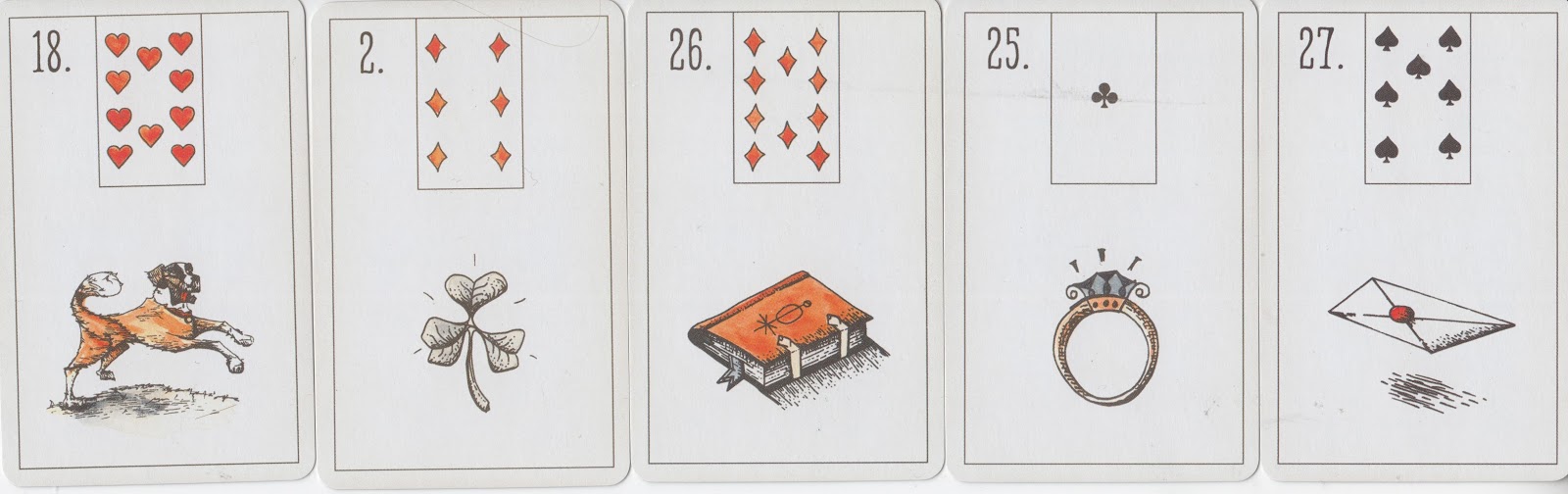
For example, though the art style may have a slightly Thothy feel and Thothy names (Discs instead of Pentacles), the scenes are decidedly RWS: 3 of Cups, 8 of Swords, 6 of Swords and 8 of Discs all have the RWS scenes we might expect. The 3 of Cups shows 3 revelers lifting their cups to the sky. The 8 of Swords shows someone tied up, surrounded by swords (though the means of escape is not quite so obvious in this depiction). the 6 of Swords shows the classic retreat to new shores in a boat. And the 8 of Discs shows the craftsman or apprentice churning out copies of his product. There are several more cards that keep to an RWS image and similar interpretation, so this deck would be comfortable for those unfamiliar with Thoth.

The Divine Feminine

You may have noticed the prominence of the oval shape in this deck. even the box has a special design with an oval opening, and all the cards are framed by an oval. In the introduction of the companion book, Cilla explains that the oval frame 'appeared very early in the journey' and is a reflection of her 'discovery of the Divine Feminine' and 'early Goddess cultures'. It isn't quite a vesica piscis, but close enough (in fact the oval is more pleasing to my eye than the pointed vesica piscis).

We could be all refined and explore the history of the vesica piscis, but instead we'll talk about full frontal boobage. The boobies kinda stood out at me in this deck, so I counted them up. We got bare norks on: High Priestess, Empress, Strength, Devil, Star, World, Queen of Cups, and Queen of Rods and let's just say none of them need any corrective surgery. So if you don't want no nipples in your tarot, be warned.

Courts

Court cards are important to me in a deck. The courts here are okay. They're mostly close-ups in profile, but most of them have enough detail to make a start, though I must be honest and say if you don't already know something about tarot, I'm not sure how much you could come up with about personality of the courts just by looking at these images. The Pages are all female, which is nice.

The colours in of the each suit roughly match. The Discs are more or less yellow (more money than earth if you ask me). Cups are blue. Swords vary a bit but tend to be reddish, and Rods are kind of dark blueish. Not particularly coded to the Elemental attributions, then. This is not really a problem for me. Sometimes stark colour-coding can be trite.

'Intuitive' Imagery

I've noticed a tendency for people to talk more about their 'intuition' when a card is a bit different from expected, or if the art work is more abstract, so that you have to look for images, rather like tea leaf reading. You get a bit of that in this deck in several cards, such as seven of Discs and One of Cups, One of Rods, Two of Discs, Ten of Discs and Four of Rods.


The Companion Book

Cilla Conway references Carl Jung, synchronicity, gestalt therapy and shadow work frequently throughout the book, and some have said this is quite a 'psychological' deck. After an introduction, Conway presents each card, two pages for each major with a blank page for your own 'intuitive notes', and for each minor, one and a half pages with half a page left for notes. 

Of particular interest to me are the 'dialogue' prompts for each card. These are meant to help us step into the card and experience it. Here are a couple of examples:

Major - Strength -- 'Dropping down into the image of the lion, connect with your own shadow (your fear, rage, greed, fury). To deny such emotions is to deny your own humanity. Try to draw or write about the type of creature that would feel such dark emotions. Don't edit or erase. If you find yourself wanting to do so, stop and look at what lies behind the urge, because that will probably be particularly revealing. Once you have done this, talk to your shadow. Seeing it as an ally, rather than repressing it, frees up its energy and allows your psyche to begin its transmutation into wholeness.' 

Minor - Nine of Rods -- 'When you drop into the image, discover his story by dialoguing with the figure, both in the third person and in the first. You may like to think about constancy and resolve, courage and self-defence. Is anything in your life so important that you would die in defence of it? In your dialogue with the figure as yourself, you may like to consider how you feel about his naked vulnerability. I found I hated the idea so much I gave him some weapons!' 

Verdict

Overall, I find this deck quite pleasing. It was a happy accident that I encountered it last weekend and I look forward to working with it more over the years. 

Friday, 26 June 2015

The Lovers' Tarot by Jane Lyle - Review

The Lovers' Tarot by Jane Lyle (Connections, 2005)
Apparently The Lovers' Tarot by Jane Lyle has been through many editions, the first one coming out in 1992 as a majors only deck. I bought the 78-card version because I watched a video of Four Queens unboxing hers and when upon investigation I discovered that the pip cards are very plain, I ordered it. I quite like pips-only decks. There's something that feels very fortune-tellerish about laying out a bunch of plain cards and doing a reading with them; I feel it shows some knowledge, and appears less like you're 'just looking at the pictures and making stuff up.' I have both kinds of decks, of course, but I think it's good to use pips-only decks, too.

This deck is called The Lovers' Tarot and it is specifically intended to be used for love and relationship readings. The 64-page guidebook accordingly confines its interpretations to that context, which makes for an interesting read. Though the book is very brief, it is packed with useful information, making it a valuable and convenient resource for quick reference. Each major card gets one page of text that includes ruling planet, element, and a keyword, a 2 or 3 paragraph explanation of the card, and two key phrases called 'essence'. I feel the book really comes into its own with the minors and courts. Instead of organising them by suit, Ace - Ten, as most (but not all) guidebooks do, this book is organised by number. For each number, all four cards are featured across two facing pages, with one-half a page each. The upright meaning is called 'The Gift' and the reversed meaning is called 'The Challenge'. Each card is given a keyword for both upright and reversed:

The Lovers' Tarot by Jane Lyle (Connections 2005)


About the art -- it's a kind of photo collage which some call awkward and clunky, but I think it's meant to be like that. The illustrator, Oliver Burston, is a professional commercial artist so I have no doubt he has the skill to create something realistic and lifelike. I just don't think that was the object here. I like that the art looks like pieces cut from the work of great masters and pasted down. I like the flatness and odd proportions. It's why I like the Tarot Illuminati as well. See what you think:

Majors from The Lovers' Tarot (Connections 2005)

Courts from The Lover's Tarot (Connections 2005)

The only down side I see to this deck is the suit of Wands. There is no movement there, and for the Fire suit, I would like to see the arrangement less static. I'll show you what I mean. The wands are used to create almost like a wall or fence as the numbers get higher. This disappoints me. I would like to have seen, for example, all of them aligned for 8 of Wands, and a bit more confusion in 5 of Wands and 10 of Wands. I know it's a pips-only deck, but there's just something about the way the wands form a kind of garden fence that doesn't seem very Wandsy to me. I would also have preferred a red or orange background colour, to reflect the Fire element. That's the only negative thing I have to say about this deck, though.


I find this an attractive deck with a useful little guidebook, and it comes with a lovely sturdy box, all for a very reasonable price. I am quite pleased with it, and feel it's a keeper.


Friday, 12 June 2015

Deck Review: Byzantine Tarot by John Matthews and Cilla Conway

This isn't one of my usual product reviews, more of just a first glimpse. I can do a more in-depth one later. 

I tend to like the decks of John Matthews.  I do not own them all but the ones I have are here to stay:

The Arthurian Tarot
The Grail Tarot: A Templar Vision
The Camelot Oracle (the system as described by Matthews is overcomplicated, but you can ignore all that)
The Green Man Tree Oracle
The Wildwood Tarot (though to be fair that is mostly Mark Ryan's work)
The Sherlock Holmes Tarot...

...and now The Byzantine Tarot,with Cilla Conway. Of those listed above, my favourite is Grail Tarot, and I believe that the Byzantine Tarot is a good companion to it. One thing I appreciate in John Matthews' decks is scholarship. When Matthews creates a deck, it's not just RWS with slightly different costumes. It's tarot iconography as it fits in a particular paradigm or context. Not every single card is a dead ringer, but in the main, it works. (Robert Place has a similar skill). In this case, the context is Byzantium.

The Byzantine Empire began in 330 AD when the Roman emperor Constantine I dedicated a 'new Rome' on the site of the ancient Greek colony, Byzantium (modern Istanbul, the largest city in Turkey). This eastern half of the Roman empire lasted another 1000 years after the western half crumbled in 476 AD, and it spawned a rich tradition of art, literature and learning, until it fell to the Ottoman Turks in 1453 during the reign of Constantine XI.

Byzantine art is almost entirely concerned with religious expression; specifically Christian theology.  The style evolved into a rigid tradition that is sophisticated, uniform and anonymous. Religious iconography in the form of mosaics, as well as fresco wall-paintings, are probably what most people think of when they think of 'Byzantine art'. And so in this tarot deck, we see the majors expressed in the style of mosaic icons, and the minors reminiscent of frescoes.


Majors - Byzantine Tarot

Majors - Byzantine Tarot 

Aces - Byzantine Tarot (sorry about the missing border) 

A few minors - Byzantine Tarot 

There is an elemental swap you'll notice in the aces -- Swords are Fire and Wands are Air. Interesting choice.

Overall it's a nice pack! I like it. :)

If you like Christian iconography and Byzantine art, you can't really go wrong here.

Sunday, 12 October 2014

Deck Review - Deviant Moon Tarot


Steampunk. Nightmare Before Christmas. Hieronymus Bosch. Where the Wild Things Are. The clockwork visions of a disturbed Victorian 5-year-old. Deviant Moon Tarot.

I've put off buying this deck for years. It was weird, it was dark, it was unsettling -- it was voted Number One Tarot Deck of All Time a few years in a row by the purple site, which annoyed me. How could it come out ahead of the Rider Waite Smith that it was clearly based on? So I thought, screw it. Who needs more darkness in their lives?

But this year, I couldn't face a month of readings with the Halloween Tarot (Kipling West, US Games). And yet, I always want to use appropriately themed decks in the weeks leading up to Samhain. So I put feelers out to other tarotists for suggestions of a dark deck and Deviant Moon came enough that I bit the bullet and purchased. The borderless edition looked more appealing than the older one, so I got that.

It's a weird deck. It is not the best tarot deck of all time. But it is a good one.

Saturday, 4 October 2014

Deck Review - Halloween Oracle


Halloween Oracle by Stacey Demarco and Jimmy Manton 
(Blue Angel 2014)

I'm growing quite fond of oracles by Blue Angel Publishing. For one thing, they come in a standard size box of sturdy construction and the cards are of consistent style and quality. I like that. I like the way a line of Blue Angel boxes looks lined up on the shelf. We've all got our kinks. 

What's included
Attractive standard size Blue Angel oracle box, black on the outside with orange on the inside, a 36 card oracle deck and an 80 page companion book that fits inside the box. As usual, the cards are smaller than the box and a liner to make them fit is not included. The book fits over the cards and sits snugly inside the box. I was surprised that the deck is only 36 cards as Blue Angel usually includes 44 cards, and goodness knows there is plenty of Halloween material to come up with more than 44 cards! A curious decision.


Saturday, 20 September 2014

Deck Review - Daniloff Tarot

Daniloff Tarot 
Daniloff Tarot 2nd edition (self-published by Alexander Daniloff)

What's included 
78 cards, plus an extra 'carte blanche' and a spare Strength and Justice, with numbers reversed. A tuck box.

The deck measures 14 x 8 x 3 centimetres or 5.5 x 3 x 1.5 inches. The box is a folding tuck box which works like an envelope rather than the usual tuck box that opens on the end. This prevents the annoyances of the tuck flap damaging the edges of cards or pushing them out the bottom of the box. There is no LWB.


Saturday, 6 September 2014

Deck Review: Conscious Spirit Oracle


Conscious Spirit Oracle by Kim Dreyer ( US Games 2013)

What's included
You get a 44-card deck in a tuck box with a Little White Book (LWB). The deck measures 5.25 x 3.5 x .5 inches. The LWB is 43 pages. 

The cards 
Measuring 5.25 x 3.5 inches (13 x 8.5 cm), the cards are a nice size for seeing the details of the appealing artwork. The cards have very little lamination and are silky and pleasant to the touch. They riffle and bridge beautifully and, like all US Games decks, feel hardy and durable. The card backs are beautiful, depicting chakra colours, the world tree, the moon phases, and all sorts! 


The art
The art has been compared to Crystal Visions Tarot. I can see the similarities, but I think the images are more varied and the technique seems a bit more accomplished in Conscious Spirit Oracle. It is a very feminine deck in style, and every card features a youthful, nymph-like female figure in various attitudes of devotion, usually with closed eyes. Your attraction to/patience for this sort of thing may vary. I have a low tolerance of glowing nymphs, and yet I like this deck very much. 

The structure
Unlike many oracle decks of this type, the Conscious Spirit Oracle is not just a set of nice affirmations. Kim Dreyer has included deeper esoterica which I appreciate. The elementals are represented in the Fire, Water, Earth and Air cards. There is a Sun goddess and a Moon goddess (I would have liked a sun god but you can't have everything). The 7 chakras are represented. There is a Maid card, a Mother card, and a Crone card. The archangels are there, too (Raphael and Michael, though quite androgynous, seem to be male, which is nice!) I would have liked to see more representation of masculine energy, but this is all too often too much to ask. I have no idea why. The remaining cards are typical oracle cards - Transformation, Balance, Celebrate Life, Gratitude, etc. 

The affirmations
The affirmations include a sort of call to action, which I quite like:

'I celebrate and honour my physical body through dance and movement.' 

'I respect all of nature's elemental beings and help preserve life on Earth.' 

'I speak my truth and encourage others to speak theirs.' 

'I celebrate each sunrise and recognise the healing energies of the sun.' 

The LWB
Each card gets roughly 3/4 a page of text expanding upon the meaning of the affirmation. Here is an example:

Card: Crystal Ascension
Affirmation: 'I am attuned to the universal wisdom and energy of the crystal kingdom.'
LWB (excerpt): 'You are being asked to bring crystals and minerals into your personal environment. Your current environment contains too much artificial energy from material possessions, cell phones, computers and microwaves which causes imbalance in your body's energy as well as the energy within and around your home and workspace.' 

The verdict
I have been using this deck quite a bit over the last few weeks and I find it quite enjoyable to work with. I'm keeping it. If you like affirmations, crystals and chakra healing and have no aversion to frolicking nymphet artwork, try this deck! 

Recommended. 

Thursday, 21 August 2014

Deck Review - Silver Witchcraft Tarot


I received the Silver Witchcraft Tarot last Friday afternoon and have been looking at it all week. Here's a little review. 

Even though the deck is borderless and doesn't have multi-lingual titles, it does scream LoScarabeo from head to toe, so if that puts you off, beware. The artwork is by Franco Rivolli, who seems to be a very prolific craftsman because he has done quite a few tarots. 

In all honesty, after just one week, I cannot say if this is a deck I will end up keeping. I will just provide you with a list of my own pros and cons. 

Saturday, 9 August 2014

Deck Review -- Tarot of the Cloisters

Tarot of the Cloisters by Michelle Leavitt, US Games 1993

The 'rose window' is a detail associated with Gothic churches and cathedrals, a round window characterised by a design radiating out from the centre in spokes or petals. They weren't known as 'rose windows' until the 17th century.

Tarot of the Cloisters by Michelle Leavitt attempts to translate the cards of the Rider Waite Smith deck into 78 rose windows. I'm really not sure why the deck is called 'Tarot of the Cloisters', because there is no cathedral that I know of that features rose windows in the cloister. (The cloister is an enclosed garden in the cathedral or abbey with a covered walkway where the holy orders could stroll in contemplation or meditation. Or maybe to have a barbecue. :) ) I suppose 'Rose Window Tarot' didn't conjure up the cathedral atmosphere in the minds of the publishers.

Apparently this deck is quite hard to find; I didn't how hard to find until after I recently bought it in a little occult shop in Burnham on Sea for £8. There were two of them there -- maybe I should have bought both of them!

Each card of this deck creates its own take on the RWS original, puts it in a round format, divides it into 12-14 wedges, and these are further broken up with black lines. Most of the images look less like stained glass windows than a painted piece of glass that has been dropped and shattered. Some images are more successful than others in creating the 'stained glass' feel, and those are the images which seemed pieced together rather than a whole being broken. But apart from that little bit of nit-picking, it's a very attractive deck.

Here are some of my favourite cards. It's really hard to tell if they're upright when you're putting them face down on the scanner, and when you try to close the scanner, they spin! So most of these are slightly rotated:


This brings up an interesting aspect of these cards -- reversals. It is quite difficult to shuffle a round deck so that cards remain upright, which leaves you with the dilemma of whether to leave the cards in the position they are turned over, or spin them around so they're all upright. My tendency is to turn all cards upright, as you know, but it occurred to me that these degrees of spin can be very telling in a reading. Which way is the card tilting? Past? (For me, that's to the left) Present? (the right) Or is it that the figure in the card is leaning toward one card and away from the other? Is the card looking up to the known, down to the shadow? All of these little subtleties can come into play with the rotation of the round cards. It's an interesting aspect of the deck.

My advice is, if you see this deck on offer at a price that's agreeable, don't hesitate to grab it. It's a good one!